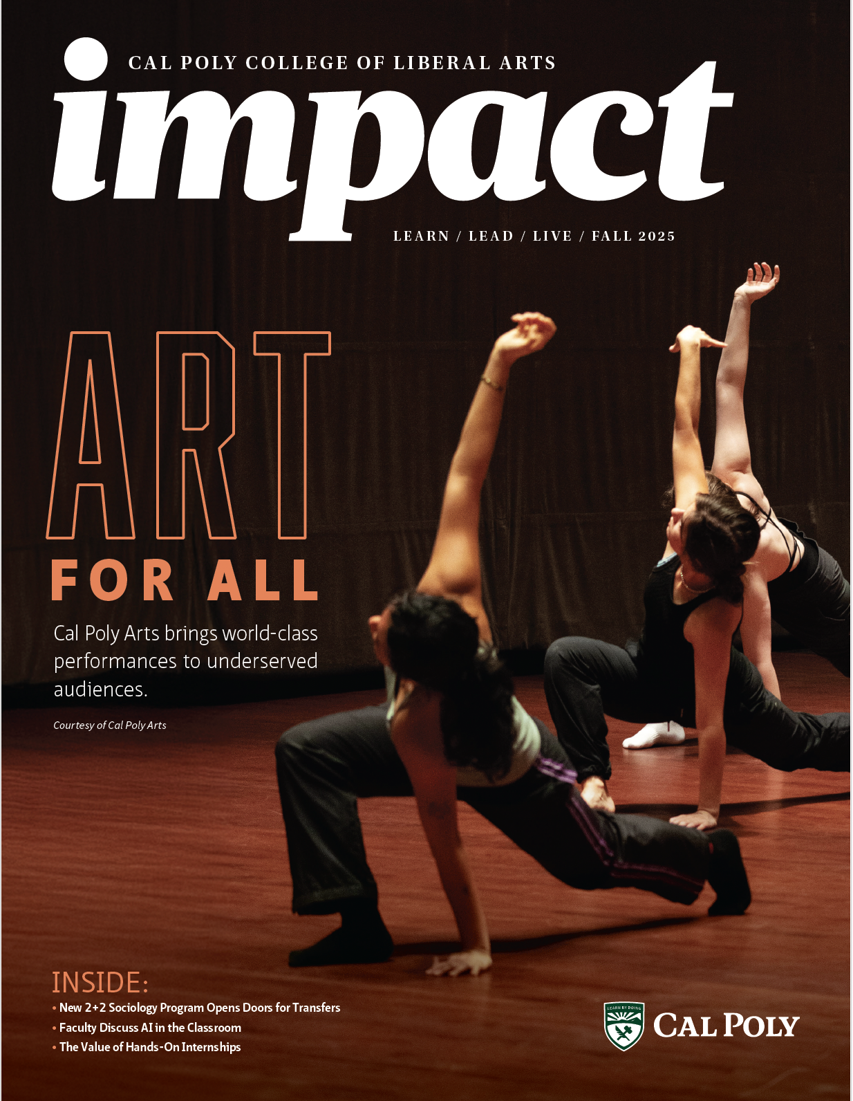
Graphic Design
Follow these basic graphic design principles for more effective designs.
Posters and Flyers Process
Departments are responsible for the design and distribution of all posters/flyers unless told otherwise.
Design
Follow the graphic design best practices below when creating your poster/flyer. If assistance is needed, contact Cara King for access to templates from University Marketing.
EXCEPTION: CLA Communication will design “CLA Speaks” flyers and posters in order to keep the look and feel among all CLA Speaks events consistent.
Standard sizes are as follows:
- 8.5” x 11” flyer
- 11” x 17” small poster
- 18” x 24” medium poster
- 24” x 36” large poster
- 24.25” x 36” A-frame signage
Approval
Please send near-final artwork to Cara King to approve. When distributed off-campus, flyers and posters may also need to be approved at the University level. If your flyer will only be posted on-campus, and for less than two months, it does not need to be approved.
Timeline
For events, it is recommended to distribute posters/flyers two to three weeks prior to the event. Plan on three days to have your flyer approved by the CLA communications team. If you’re distributing to a wider audience, please leave seven days for approval at the university level as well.
Requirements
- Cal Poly logo with plenty of buffer room
- Correct implementation of Cal Poly visual and written style guide
- The five w’s: who, what, when (date and time), where (building and room), why
- Limit description text to 150 words
- Sponsorship information
- Sponsorship information for the lottery fund should be listed as follows: College of Liberal Arts' Lottery Speakers Fund
Graphic Design Best Practices
Layout Matters
The viewer’s eye will naturally scan from top to bottom and left to right. Keep this in mind when creating your layout.
Typography Tips
Abolition, Source Sans and Utopia are the official Cal Poly brand typefaces. Be sure to follow university typography guidelines on when and how to use the various font treatments.
Impactful Color
To solicit a certain emotion, understand what various colors signify (such as red for action and blue for peaceful). Stick to palate with 2-3 colors and utilize contrast for a stronger impact. Cal Poly color palettes should be used whenever possible.
Leave White Space
Don’t crowd a design with text and images throughout every inch, which will overwhelm the viewer. Leave white space to improve readability and visual appeal. Frame key elements by using white space.
Cal Poly Logo
Maximum readability is critical to maintaining the Cal Poly brand. Use simple, neutral backgrounds and leave equal and adequate spacing around the top, bottom and sides of the logo.
For a full list of Cal Poly-specific graphic design standards, visit the University Marketing website.

